Man, the Double S was hard to resist
Law Firm of Seth Stein, P.C. didn't have a visual identity. At all. Designed by Carlos pitched the value of creating one and won the project.
Off to work we went. As always, we started with sketches. These are a sampling of our plan to use the S's of Seth Stein as a brand mark.

CONCEPT 1: NO LIMITS
We came up with a few concepts for the group: This one's infinity implied “no limits” for the lengths the firm would go to for clients.
And then the “S” for Seth Stein, naturally.

Concept 2: Tradition
A more traditional approach. A double S served as the brand mark and it evokes the ampersand, which is inclusive and implies a closer relationship

Concept 3: The Winner! (well, mostly)
We really liked the propositional density of this concept. It was high. The brand mark was liked by the firm, but deemed too risky for a traditional law firm. Either way, the fountain pen/building is laying in wait for future usage by the firm.

Results: A useful identity
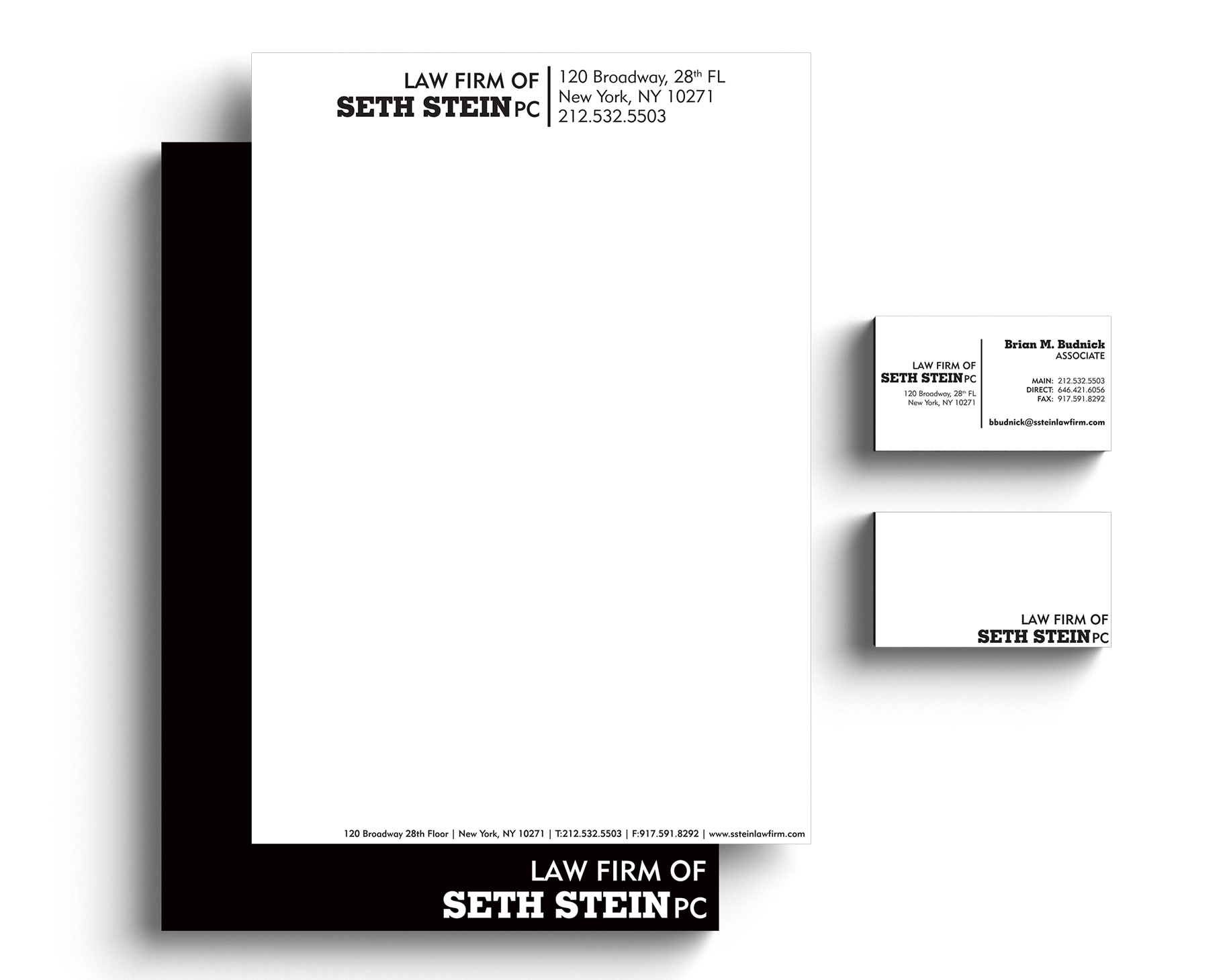
We made some tweaks, and came up with a stronger identity for the firm than they had. We avoided color, but left the option there for the future.

Business cards are the face of the organization
Printed on a heavy textured stock, the business cards have character, just like the people they represent. We loved working with the people of the law firm, and can't wait to do more with them!


