FinTech Inclusion: Design and Branding Partnership with Bank of America Breakthrough Lab™
FinTech Inclusion: Design and Branding Partnership with Bank of America Breakthrough Lab™
The Brief
Bank of America had established an accelerator program for minority founders from underserved communities to provide access to expertise and mentorship for early-stage businesses. This lab’s main goal is to help turn ideas into reality by unlocking economic opportunities for people and communities of color.
For the six-month part-time program, DBC worked hand in hand with Bank of America to provide branding, strategic marketing elements, and web design for 5 fintech startups.
Client
Bank of America Breakthrough Lab™
Capabilities
Creative Ideation
Brand Strategy
Brand Development
Digital Transformation
User Experience Design
Web Design
Deliverables
Companies Visual Identity
Brand Kits (Logos, Color Schemes, and Typography)
Social Media Templates
Multi-page Websites
Motion Design Integrations
Email List Signup

The Goal
To participate in furthering economic justice, DBC and Bank of America Breakthrough Lab™’s team worked towards a precise goal: to provide startups with crucial knowledge to succeed.
The startups needed several elements for their brands, ultimately to have branding kits, websites, and visual assets professionally created for their businesses, along with expert advice to move forward.
The DBC team worked with the different businesses on Branding Creative Ideation and web design. The focus was to present businesses with several logos, color schemes, and typography to choose from, after meeting with them to know more about their missions and visions.
The Challenges
The partnership with Bank of America to work on economic justice is at the core of our mission as a company and a team. For that, our team worked towards capturing the essence of these companies and then creating a look and feel for their brand identities. In the beginning, DBC creators had to step into the world of each and every company and create an identity from scratch that their target audiences would gravitate to while distinguishing them from other competing brands.
As a base, the focus was to start with the visual brand assets and guide. Our Minister of Website Design & Development communicated with the founders to edit and refine, and train the founders on how to use their respective websites, and handed over the keys! The distinctive feature of these businesses is that they all were in their early stages. Even though it is an exciting phase to create and experiment, their copy, content, and imagery were limited. We made sure to create easy-to-navigate websites as these companies grow and evolve.
The Solution
The collaboration lasted through the first quarter of 2022. Several rounds of meetings and discussions took place to construct a solid base for these businesses to build on them. Everything our partners had envisioned was ready. We helped our partners obtain various elements. Our fully remote team guaranteed that all the assets were done impeccably.
The mediums included:
Brand kits:
Logos
Color Schemes
Typography
Websites with
Email list signup
Blog integrations
Multi-page websites such as careers pages
A number of options were presented to each team to choose the one that captured their vision the most. The options were infused with our best expert knowledge in branding and the aspiration of the teams.
Imagery and graphics were sourced particularly per website, customizing them as needed to be on-brand, with layouts designed specifically to utilize the information available.
Each website had its own unique flare. Some of the themes and art directions that inspired the work are equity, family, the intersection with fintech, futurism, and innovation.


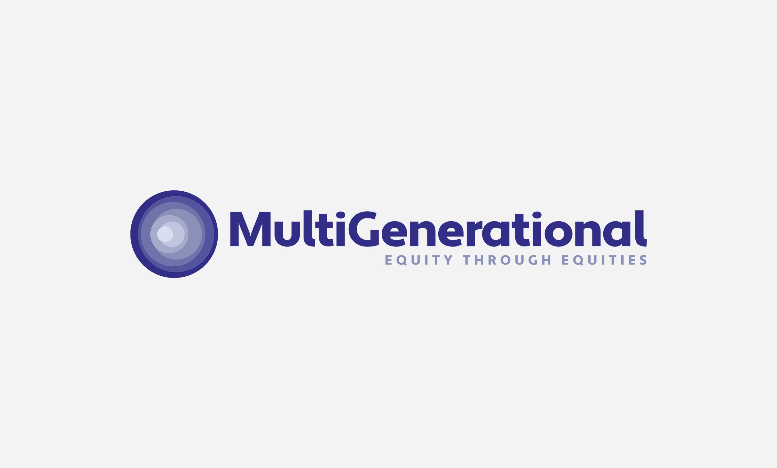
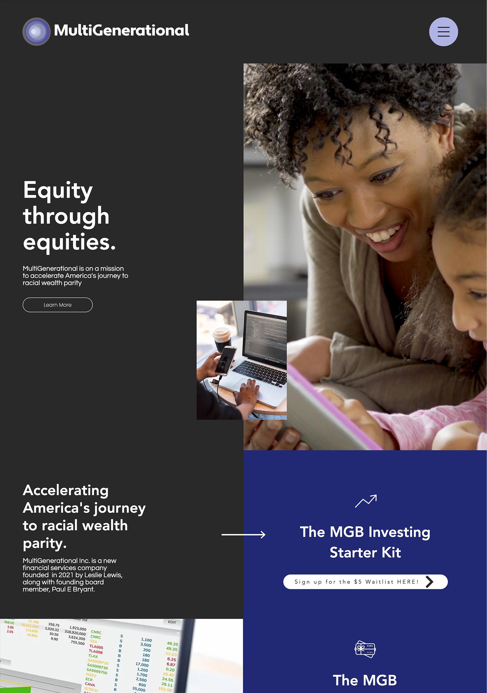
Project I
The brand feel was a big focus compared with the product offering. The choice of visuals, images, and videos was intentional. This website is bookended by videos of joyous BIPOC adult and child interactions to parallel the startup mission of multigenerational wealth.
Compared to the eight months before working with DBC, in only the first four months after their rebrand and website redesign, this brand saw:
site sessions
unique visitors
newsletter subscribers
Project II
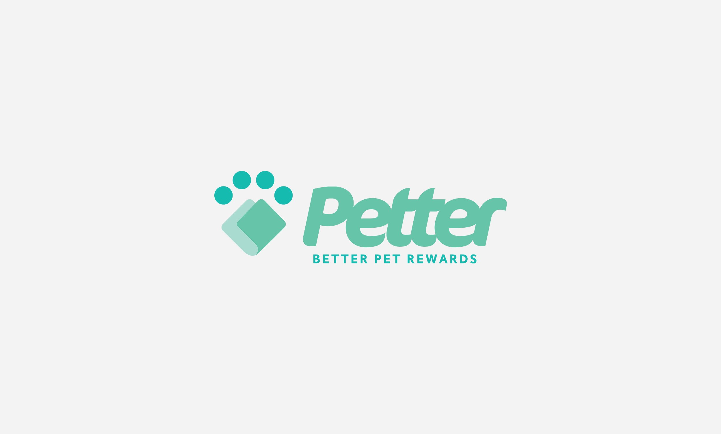
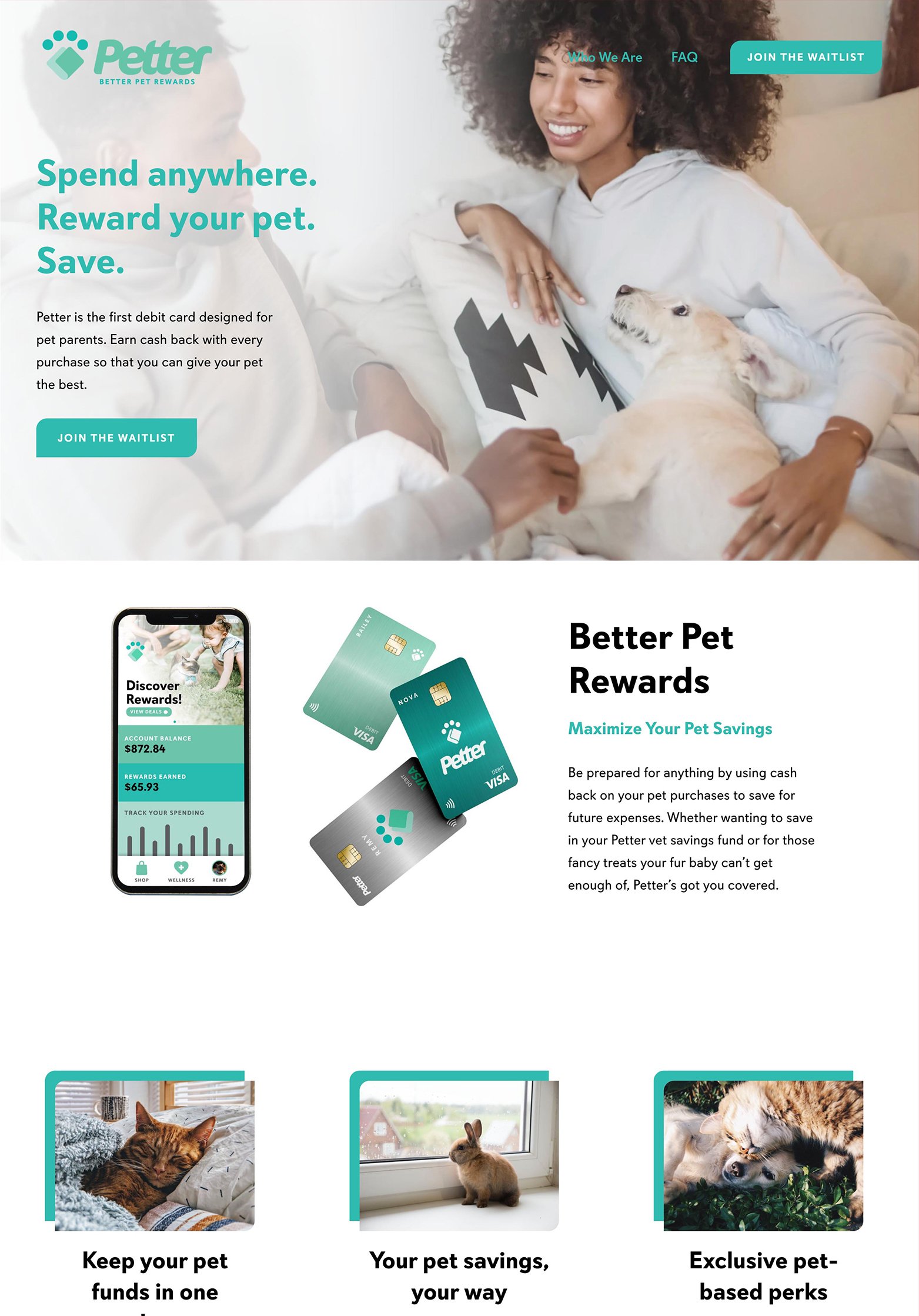
The second project was designed to have a fintech feel reflected in the app mockups, icons, and negative space with an appealing twist. The main goal of the website is to drive signups to the newsletter list, which is why a large newsletter block was integrated into the footer of the site on every page. The icons were customized to the brand with the stylistic details tied with the curves of the logo, making the website feel like a natural extension of the visual brand assets.


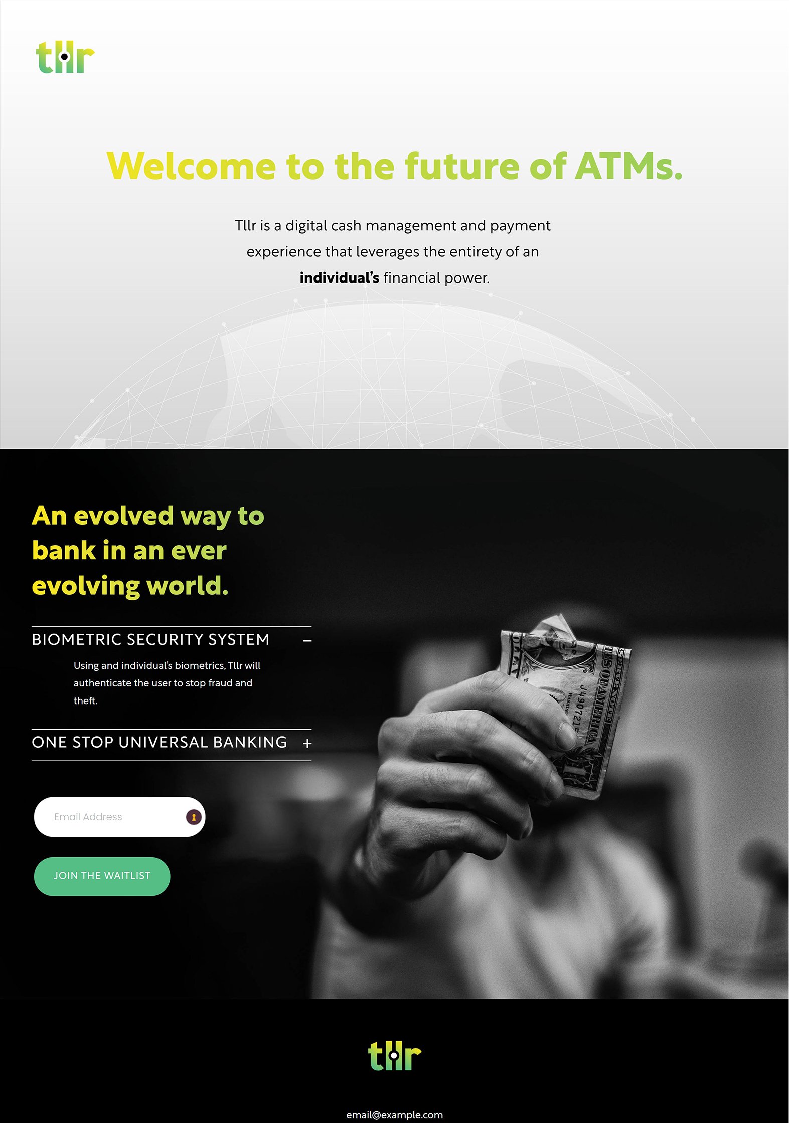
Project III
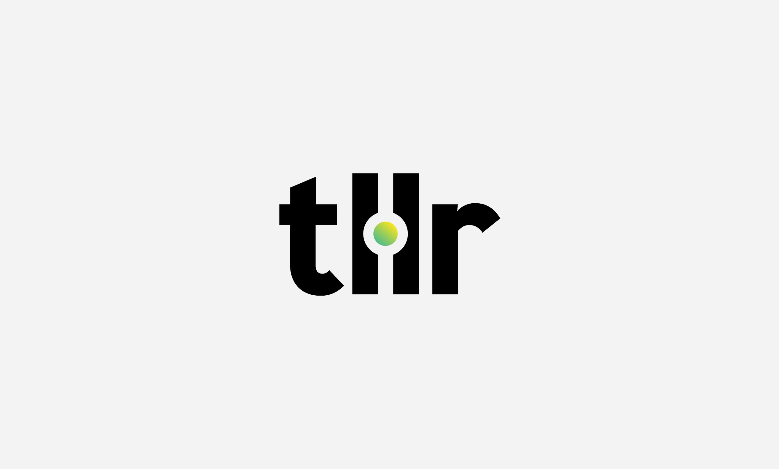
The website was designed to capture a futuristic feel. The logo featured a graphic inspired by a biometric scanner, which was used an animated the header throughout the website. The color of the text is a green-to-yellow gradient that "scans" across the text representing a biometric reader. Rather than using imagery featuring old-school ATMs, customized graphics were the main visuals utilized throughout the website.