
Together Again: Digital and Print Branding of The 2022 J.P. Morgan Tournament of Champions
Together Again: Digital and Print Branding of The 2022 J.P. Morgan Tournament of Champions

The Brief
The 2022 J.P. Morgan Tournament of Champions has come back in 2022 after more than two years of being on hold. The tournament is the oldest, annual competition for squash professionals in the world, with a lineage that could be traced to the 1930s. A women’s invitational draw to add to the event in 2001 with a full championship draw added in 2002-2003, 2005-2007, and from 2012 forward. This year, it was the first event of this scale to be hosted in the iconic Vanderbilt Hall at the Grand Central Terminal, in New York City.
The tournament took place in early May 2022, after being postponed from January, due to the spike in Covid-19 cases related to the Omicron variant. However, activities are thankfully coming back. Guidelines provided by the U.S. Centers for Disease Control (CDC), the World Health Organization (WHO), the NYC Department of Education, and the City of New York were followed throughout the tournament for everyone’s safety.
Client
John Nimick, Squash Engine
Capabilities
Creative Ideation
Brand Strategy
Print Design
Motion Graphics
Digital Transformation
User Experience Design
Web Design
Deliverables
Tournament Visual Identity
Signage
Badges
Street Banners
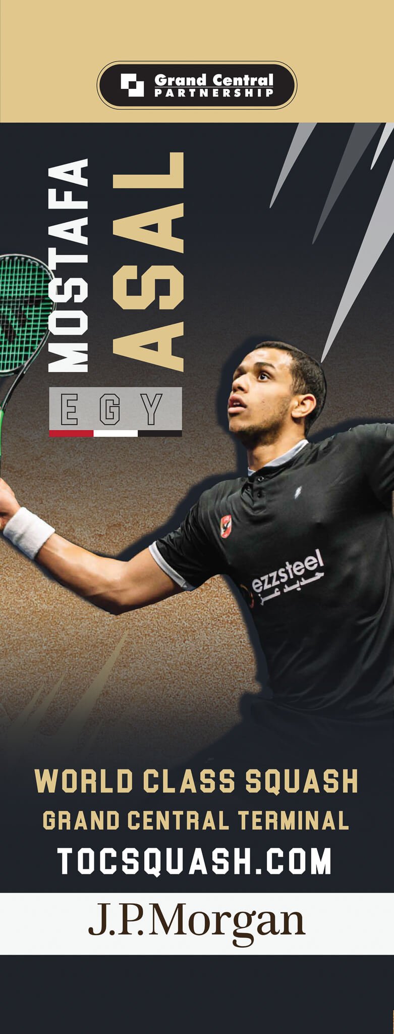
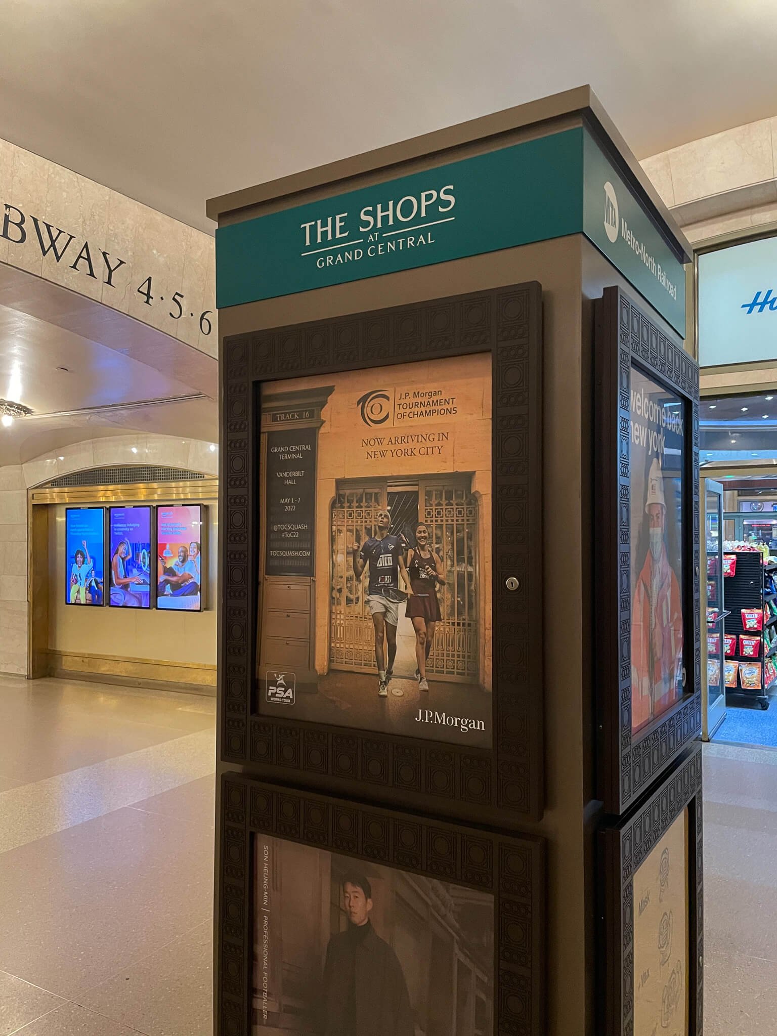
Player Cutouts
Print Programs
Digital Program Website
Custom QR Code

The Goal
With focused effective communication and planning between DBC and the organizing team, our mission was clear: to produce digital and print marketing elements and branded components that capture the voice of the tournament within the majestic Grand Central.
Organizers of The 2022 J.P. Morgan Tournament of Champions, Squash Engine and John Nimick, required several design assets to accompany the event. The goal was to increase and highlight brand visibility, as well as advertise, and equip the audience with a source for the tournament news, the schedules, draws, and updates.
DBC worked on the creative branding of the tournament through two aspects: print and digital. The main focus was to feature the achievements of the players and those who made the event possible. The creative was scaled to transcend from print to digital. This art direction had the visual aesthetics match the look and feel of the Grand Central; blending seamlessly with a brilliant aesthetic pop.


The Challenges
For an event of this caliber, the assignment was monumental. The 2022 J.P. Morgan Tournament of Champions was a paramount opportunity for DBC’s team of experts to work not only on creating branding elements for the tournament but also to create a lively atmosphere for a long-awaited sporting event. With a briefing to grasp the general feel Squash Engine and John Nimick were looking for, it was left to us and our devices to develop design concepts.
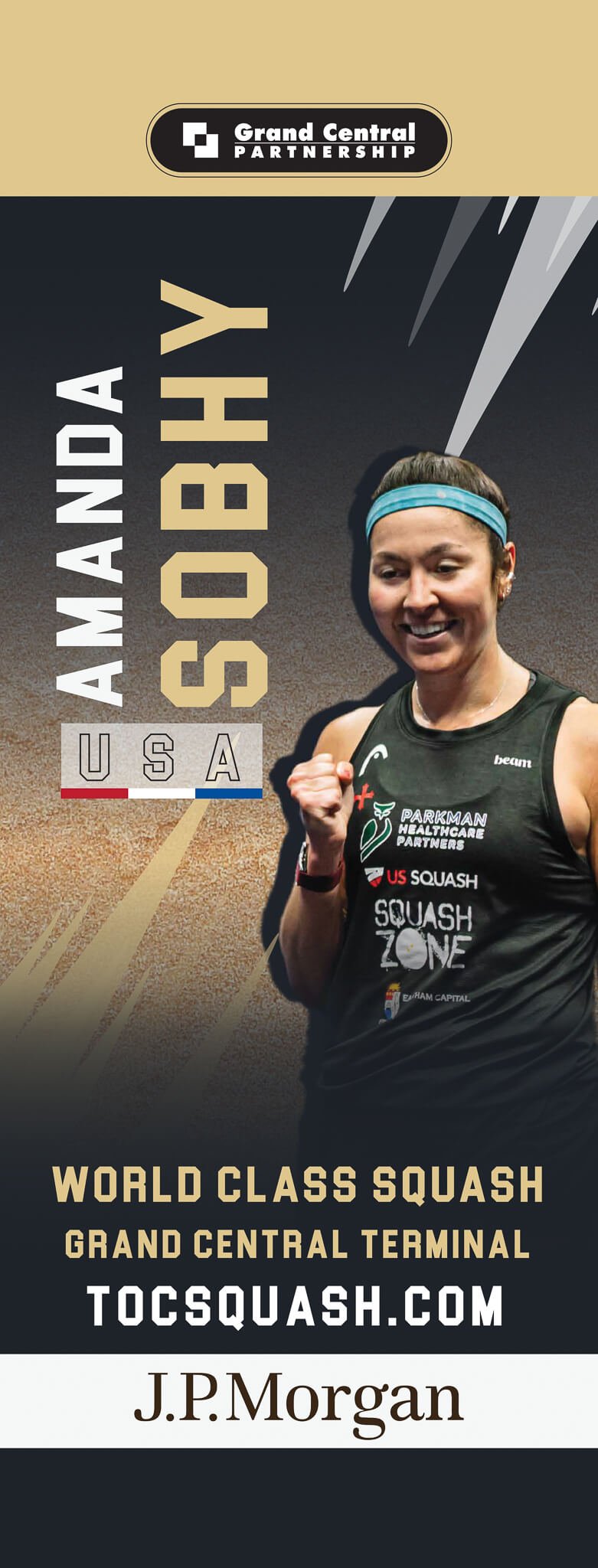
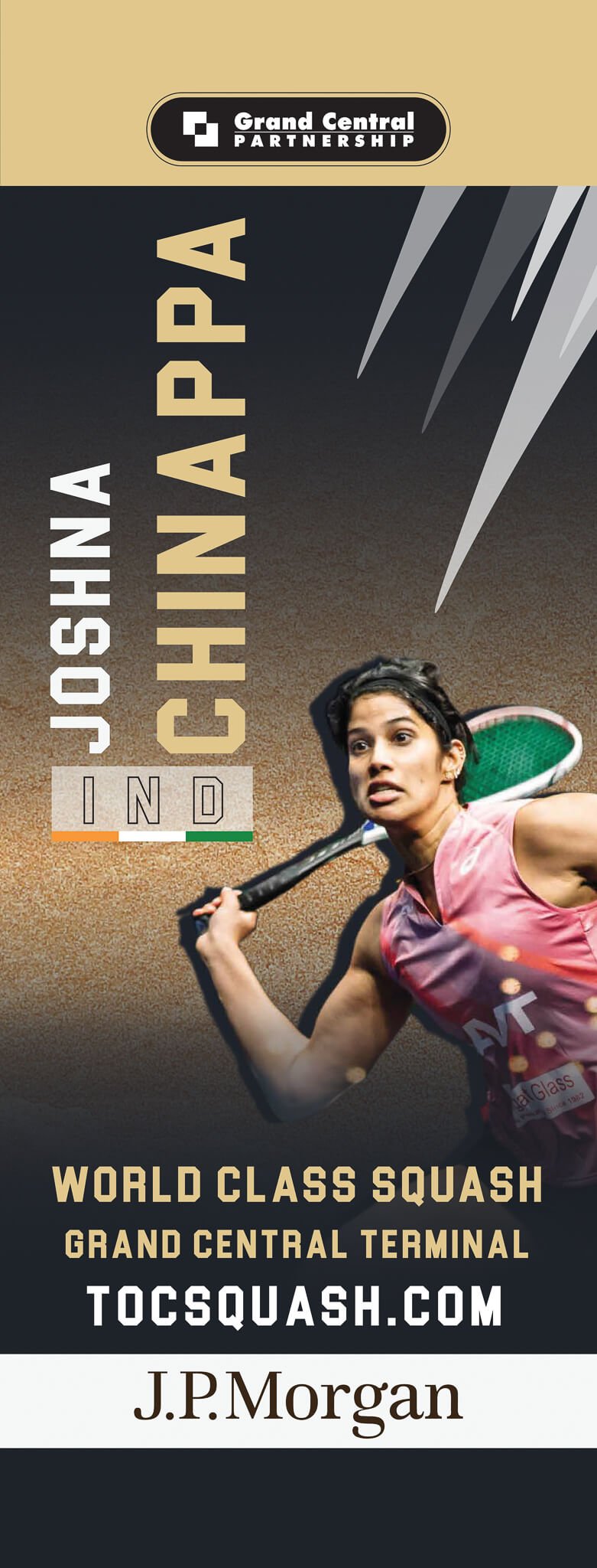
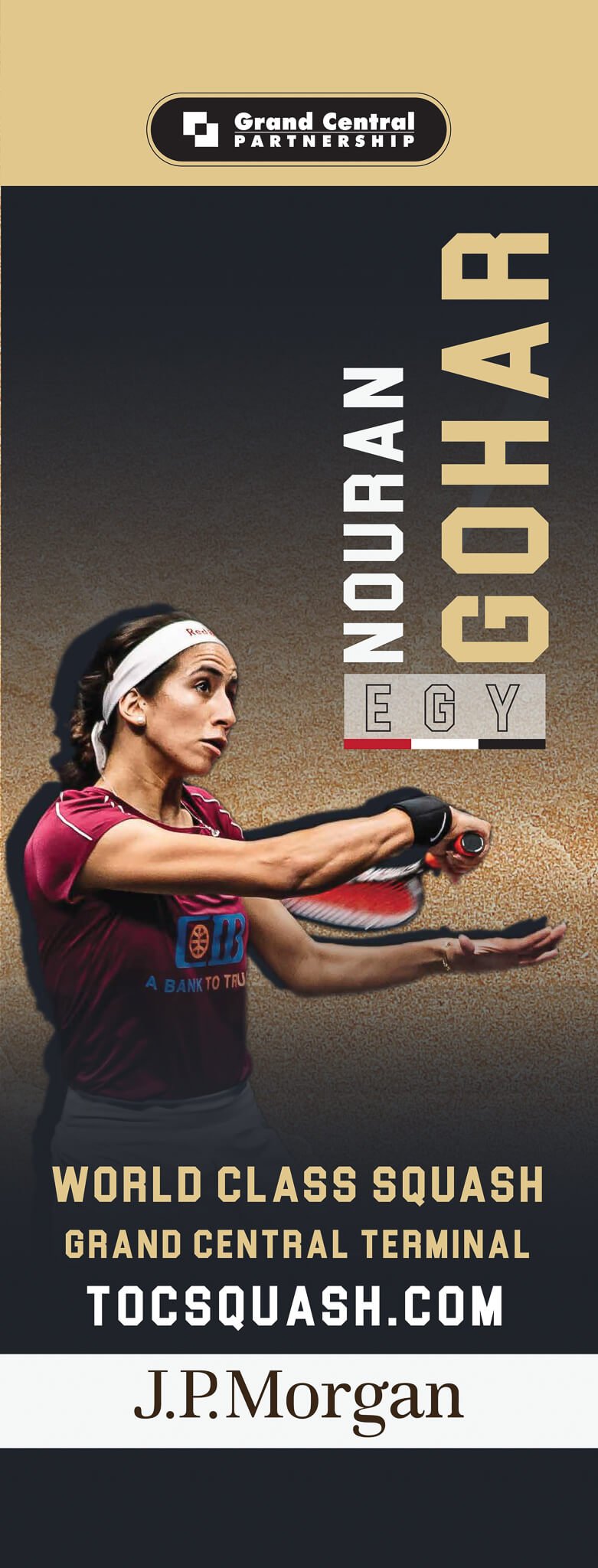
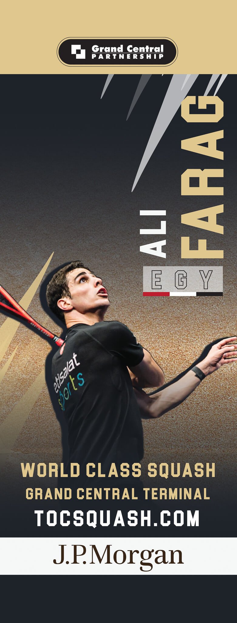
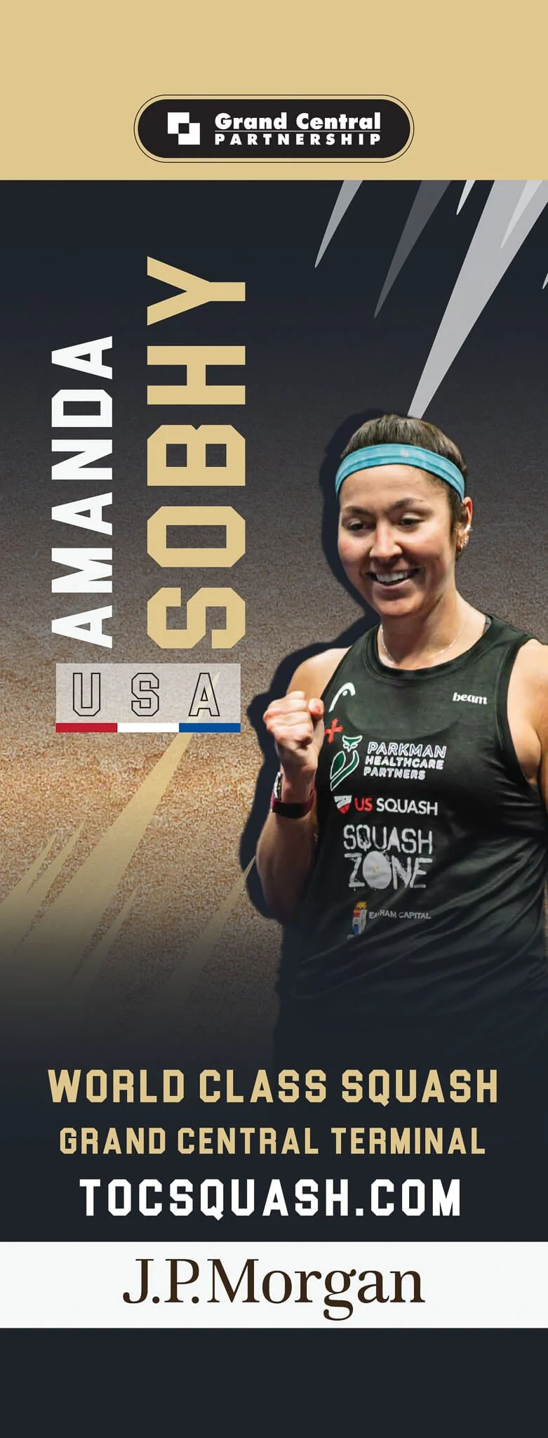
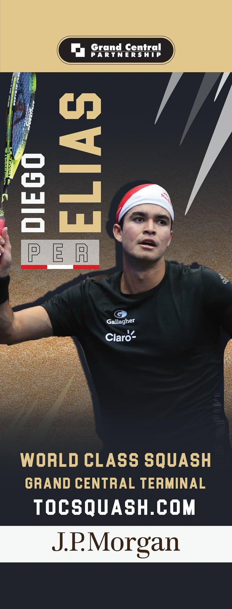
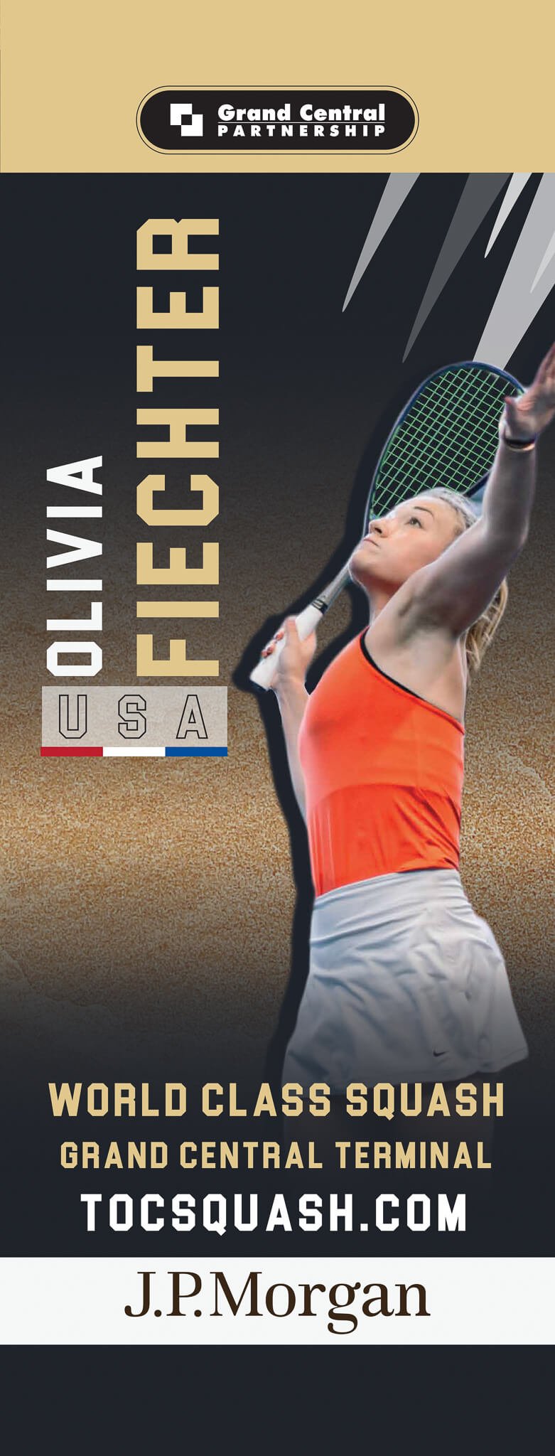
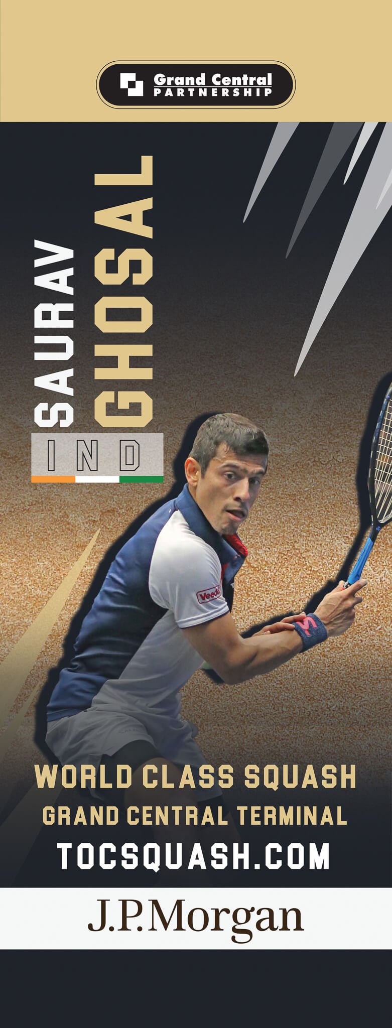
The ask included putting together a creative graphic that can be scaled into different sizes for print and digital. Our Minister of Brand Campaigns utilized Photoshop to produce images of the squash players. This has required heavy photo manipulation to make the squash players look as if they were walking out of the train station. Throughout the project’s duration, we made sure we were available to give prompt responses and provide options for our creative graphic so that our client can see what works and what doesn't; as well as approve assets were approved so they can be sent out to our vendors for production on time.
Digital
On the digital side, the main challenge was to guarantee the mobile program was as engaging as the desktop program. Since most visitors would be using the digital program while attending the event, we estimated that over 90% would access it via a mobile device. Accordingly, the work to build the digital program in the month leading up to the event.
As our Minister of Website Design & Development created the site with predominantly mobile viewers in mind, the effort went to figuring out how to make information feel as engaging on a smaller screen as it does on a larger one. Rather than predictably stacking the information in a single column, the boundaries were literally stretched on the content’s layout to create a unique, textured, and action-oriented design. Since it was the first of its kind, the program was built entirely from scratch using a grid-based design system.
The Solution
After several phases of communication and discussion to bring the creative assets to where the client had envisioned, all were impeccably ready. The art direction was to have the visual aesthetics blend seamlessly with a brilliant pop to match the look and feel of the exquisite event location: The Grand Central Terminal.
We helped our client promote the event through various mediums. Our team worked fully remotely, yet ensured to get all the assets done promptly.
The print mediums included:
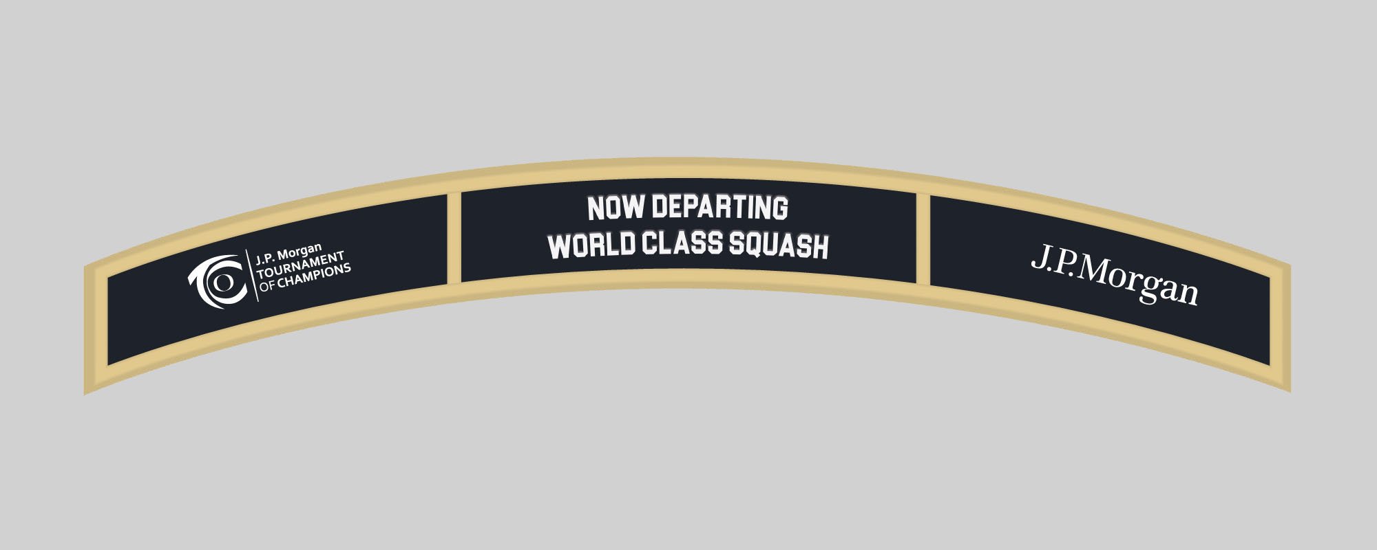
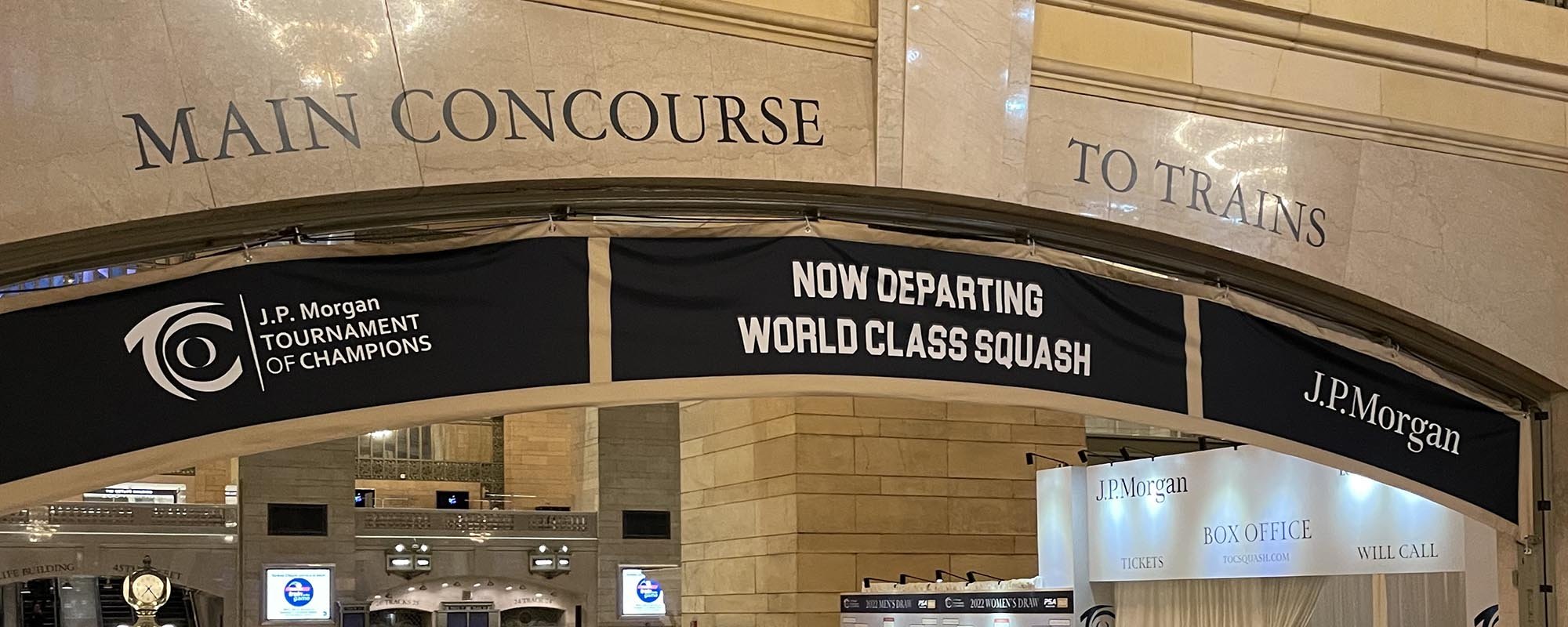
Signage
Badges
Street Banners
and Player Cutouts
Innovatively, The 2022 J.P. Morgan Tournament of Champions program was the first time the tournament went paperless.
The signage, player cutouts, banners, and all other print material were developed and submitted on time. The banners were seen decorating 42nd Street all the way to the Terminal while the player cutouts and other print displays were placed indoors to maintain brand visibility for those attending in person.
Digital
The digital program was both engaging and informative. The vibe the matches’ program was developed looked integrated with the rest of the design assets; same colors and fonts, as well as similar imagery, to create a consistent, cohesive look similar to the real-life experience. It was predominantly accessed by QR codes we had placed on the venue for easier use on the user’s end and to allow us to track data. Similarly, the mobile-friendly design was translated seamlessly from the desktop one.
The interlocking block design for the primary pages (Welcome, Meet the Men, Meet the Women) gave the program an elevated, modern feel while also creating an asymmetrical visual interest that draws the eye down the page and encourages users to keep scrolling and interact with the content. Videos of the players were used on the primary landing page, and hover effects and scroll-based interactions were employed to give the program movement and make it more engaging for users.
The program included:
Welcome Letters
Lists of Players with Individual Player Pages
Venue Information
History of Champions
A "How Squash Works" Primer
Sponsors Credits
Ads
Ads and sponsor logos were linked directly to their source websites, enabling users the ability to react to the ads in the moment. The sponsors and ads were also strategically placed throughout the content, not tacked on the end or pasted at the bottom of the page, to increase the potential for interactions. The embedded tournament draws (winner brackets) were a key element in keeping users engaged with the site and was one of the unique features that set the digital program apart from past print programs.
