
The Curious Case of a New Legal Identity
the brief
Seth Stein P.C. is a law firm in New York with passion and expertise in providing personal, friendly and responsive counsel to solve time-sensitive and complex problems. However, they were lacking a visual identity. dbc worked with the millennials on the team to sell Seth the value of an aligned identity, which he eventually acquiesced to. This began our remarkable design journey.
the trial
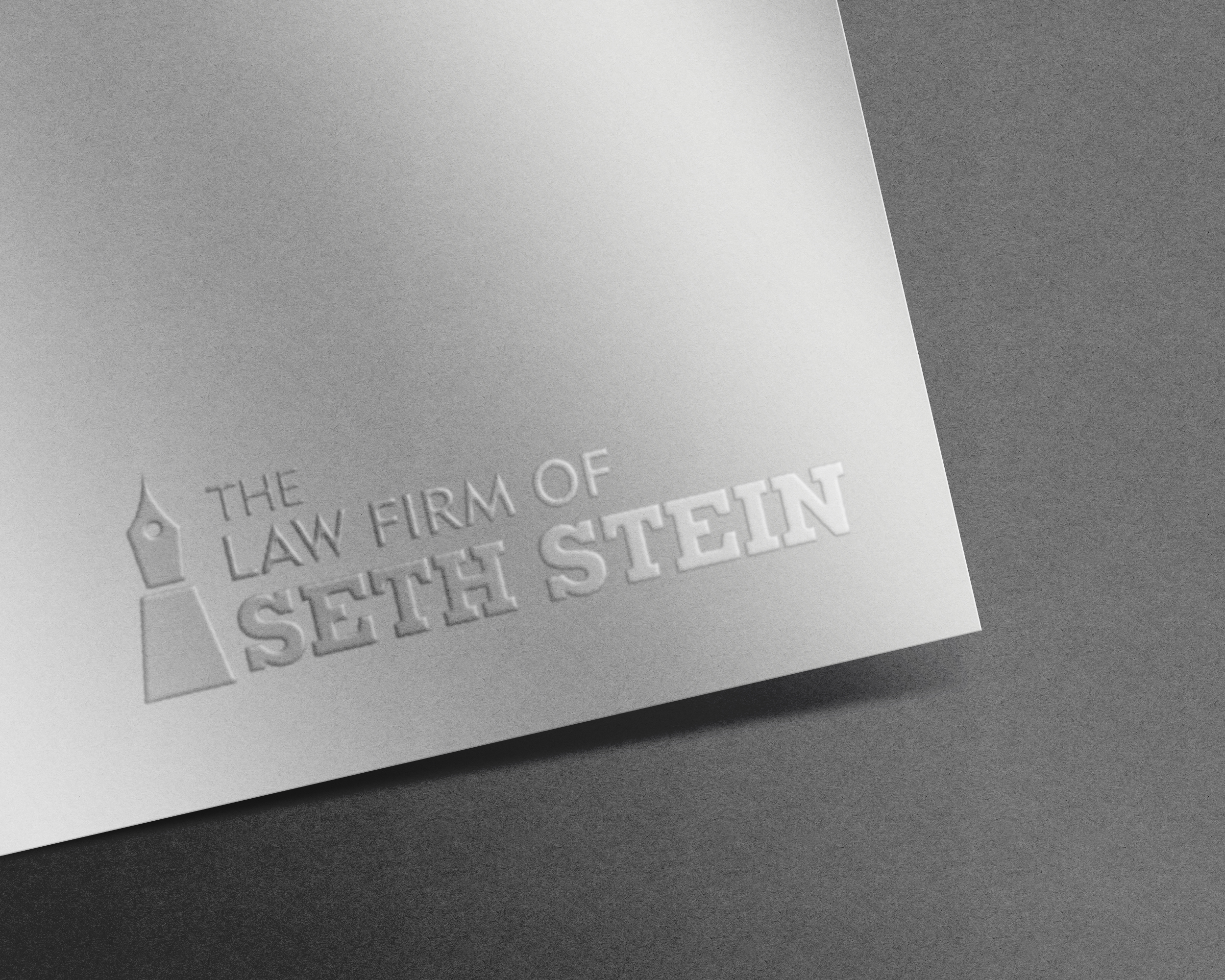
DBC designed many concepts that played on the alliteration of Seth Stein's name, but dismissed them (with prejudice) in lieu of a more symbolic approach. We presented a theory that focused our brand strategy on creating multiple meanings, through propositional density. Our defense began there.
The firm cross examined our design strategy, asking whether it would be risky to use a brand mark, which is unusual in their field. We responded with all the benefits of the mark, from the fountain pen (contracts) to the castle (real estate) to the sturdiness (reliability) of the mark. We felt this was perfect for a transactional real estate attorney's firm.
The firm was sequestered (in their office) for days. The firm chose to mitigate their risk and to use only the wordmark we created for them in their branding efforts. Their judgement hinged on the brandmark being too unique for industry norms. However, if they choose to use it, the fountain pen is laying in wait.
the verdict
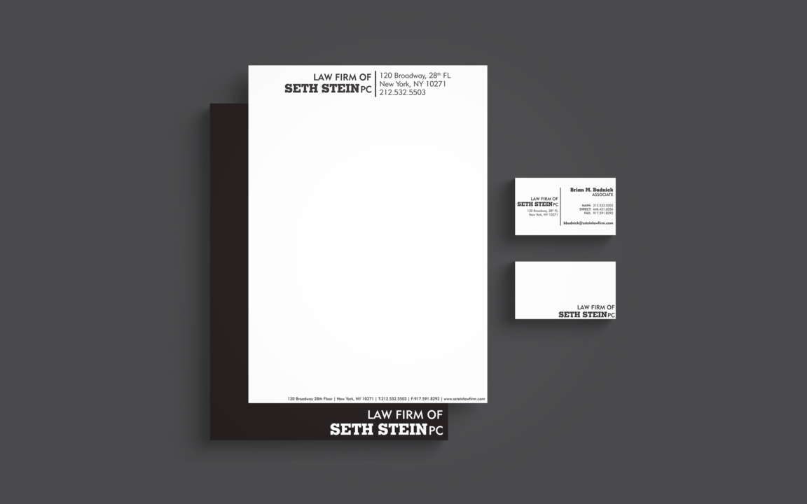
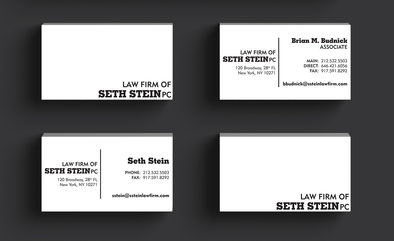
We made some tweaks, and debuted a strong visual identity for the firm. We avoided color, focused on minimalism, and typography. Printed on a heavy textured stock, the business cards have character, just like the people they represent. We loved working with the team at Seth Stein, and have been sentenced to work with them more!