Utilizing Symbols to Create Unique Branding

A family name with an geometric connotation
Every great brand should have a strategy behind it. This strategy should not only focus on potential clients, but should also emphasize what makes the company stand out in their industry.
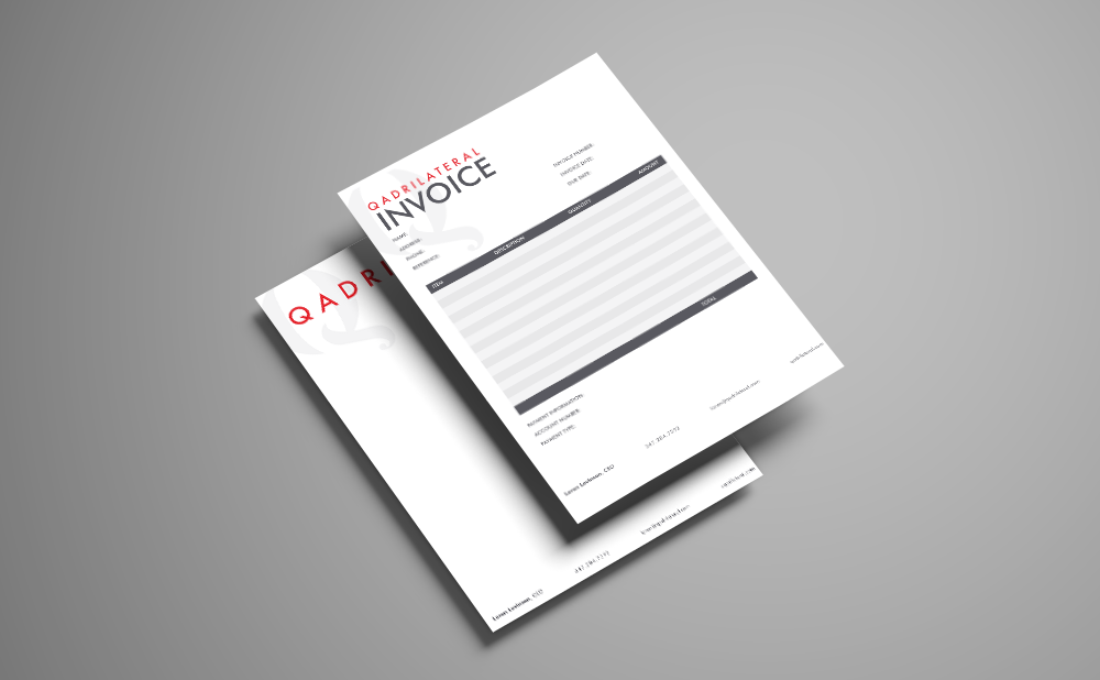
When first shown the name Qadrilateral, we assumed it was a typo and searched for the Marketing Consultancy Quadrilateral. The confusion helped us hit on our strategy early on. We figured out that it was especially important to have clear typography for this client. We decided to employ mathematical symbols in the typography because the client wanted to highlight her strategic approach to marketing.

math makes the identity add up
We set out to create a brand reflective of the client's belief that marketing should be about precise calculations, not overspending.
Mathematical symbols fit perfectly with this idea. We were able to integrate quite a few just in the logo:
The brackets represent absolute value
The brackets suggest a formula
The integral symbol is necessary to the completeness of the whole
This strategy added a creative and intriguing edge to the brand. Without knowing anything about the company, the viewer is primed to view the company as logical and calculating.
Solving the equation
This tactic was ultimately effective because the client's goals were aligned with the brand design we created. The client knew what made her company special, all we had to do was listen. With an aligned brand and a little creativity, we found our formula for success.