The Project we made investment banking approachable
337 Frontier Capital LP is an owner-managed boutique investment firm that focuses on under-researched and inefficient markets in Africa. They came to DBC in need of a new identity to align their growing brand.
We wanted the brand to reflect the name and story behind the business. 3° 37° is the longitude and latitude of Mount Kilimanjaro, so this became an integral part of the brand.
The split “O” in Frontier signifies the two degree symbols from the longitude and latitude 33° 7°. When combined, these two O’s create the two halves. It also resembles the world, the two sides representing the two continents 337 Frontier are bringing together. The axis is rotated 337 degrees clockwise which incidentally is the inverse of the angle at which the earth tilts (23 degrees.)
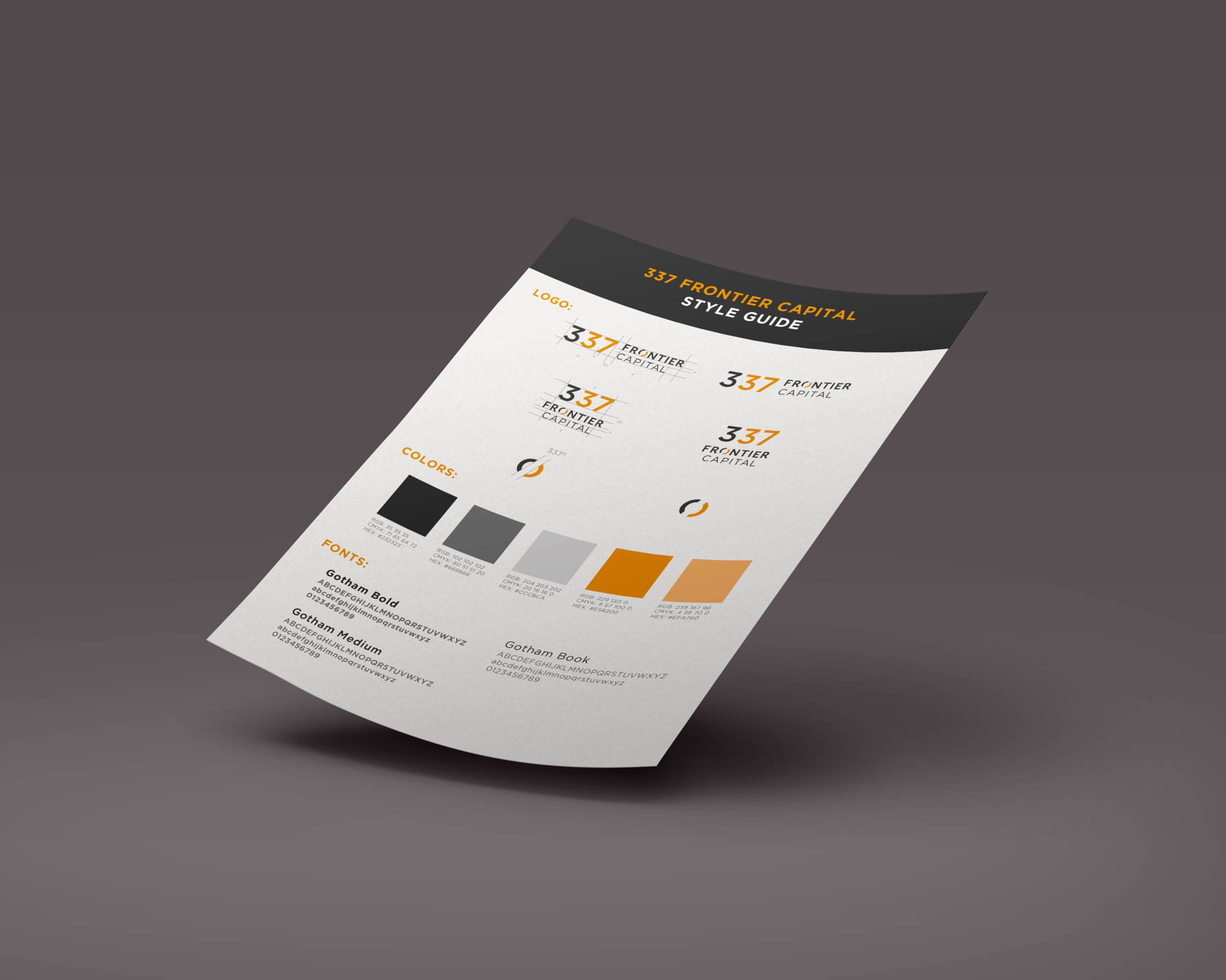
Once the logo was in place, we developed a style guide detailing how to implement the brand going forwards.
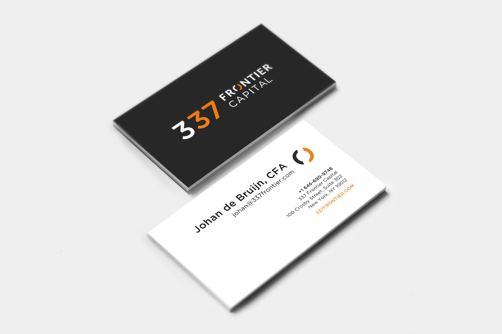
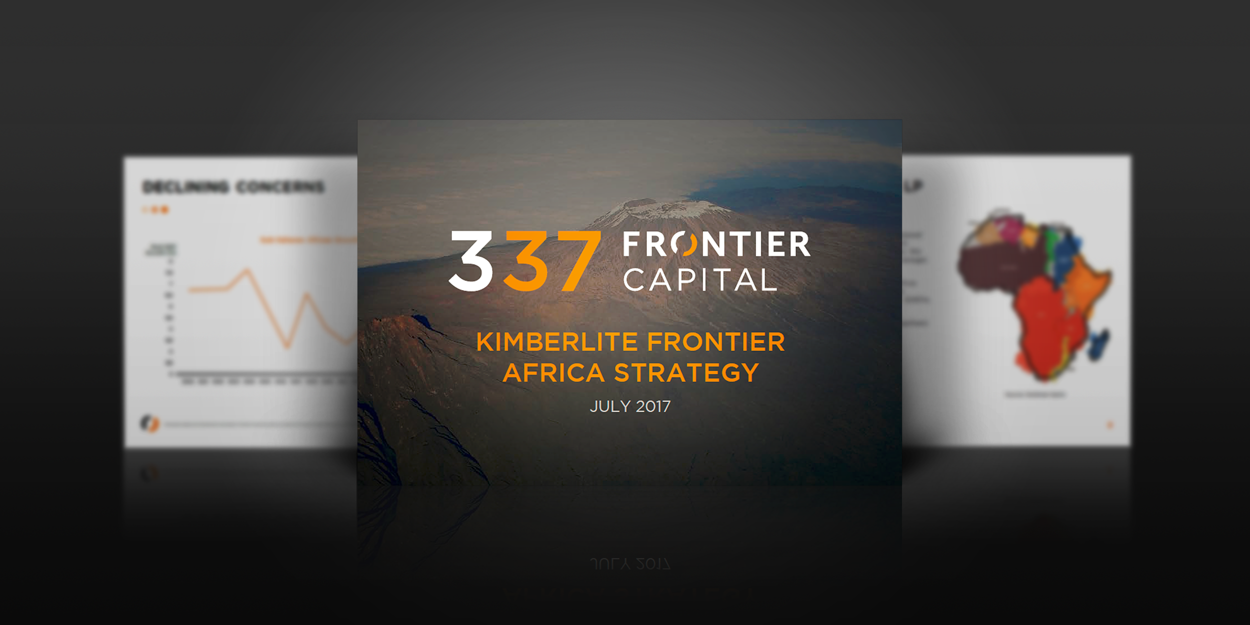
Next we designed business cards, a PowerPoint deck, and various report documents using 337 Frontier's new branding. When completed, all of the assets matched and complemented each other well.
The new identity was a great success. Our client contact at 337 Frontier said the following about working with DBC:
“It has been a pleasure working with Carlos and his team on our brand. They came up with creative ideas for our business, responded timely and within budget. They have been a perfect fit for our young and growing business.”
This was an exciting project for our team, and we're thrilled with how the branding and other assets came out. Thanks to 337 Frontier for choosing us as their brand partners, and we look forward to working with them again in the future.
Keep an eye out for their new website coming soon!
www.337frontier.com


