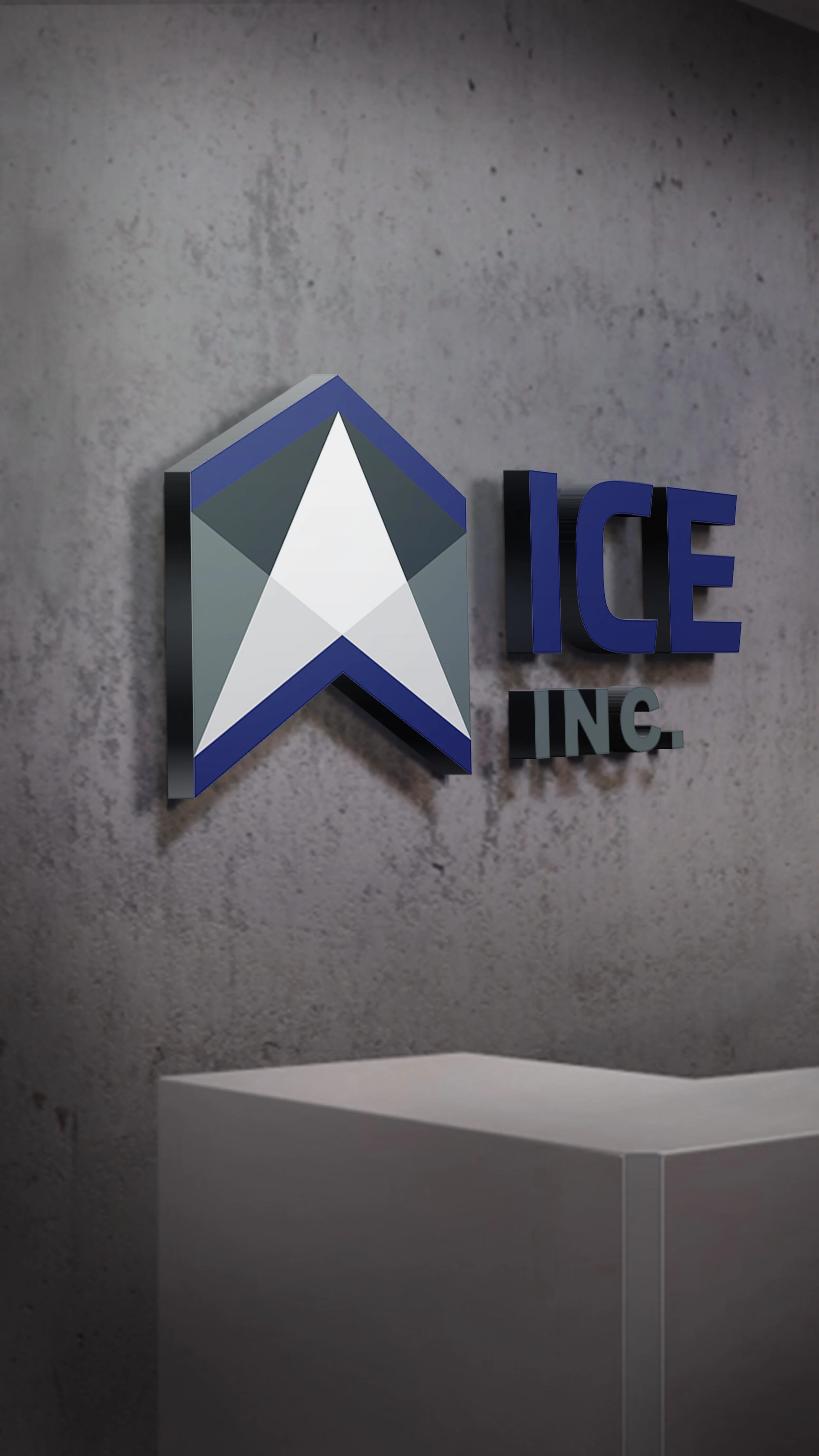
A new identity for a company of retired Special Operations Personnel
Intelligence, Communications and Engineering, Inc. (ICE) is a government contractor, providing support to United States Government Agencies, with a focus on Training, Intelligence, Cybersecurity, Modeling & Simulation, and Administrative services.
ICE Inc. sought a more modern brand, that would help with brand recognition, but also with recruiting of mostly military veterans. Their logo, while having been in place for the entirety of the organization, was not well received among the hundreds of retired special forces service members they employ.
Any new brand from ICE Inc. had to project strength and confidence. Building an association of the new logo with power and resilience, the final logo is based on a steel mountain embedded within a military crest.
The New ICE Inc. logo projects strength, trust + reliability.
Once aligned on a logo direction, a style guide was developed detailing how to implement the brand consistently across all channels. We then applied the brand to the website, and print identity.
Watch the results unfold.
Companies have many reasons that lead them to a full rebrand. In the following video, we explain how this particular mission got off the ground, and the process it took to go from concept to final execution. The ICE Inc. rebrand Presented one of the most drastic before/afters we’ve ever executred.
Are you ready for DBC to take your brand to the next level? Speak up, and we'll chat about the results we can create for your organization.


