Typography in Logo Design
When you think of a brand's identity, the first thing to come to mind is most likely the logo mark. The Nike swoosh. NBC's peacock. Target's target. Next, you might think of the color(s) associated with the company. T-Mobile magenta. But what about a brand's typographical elements?
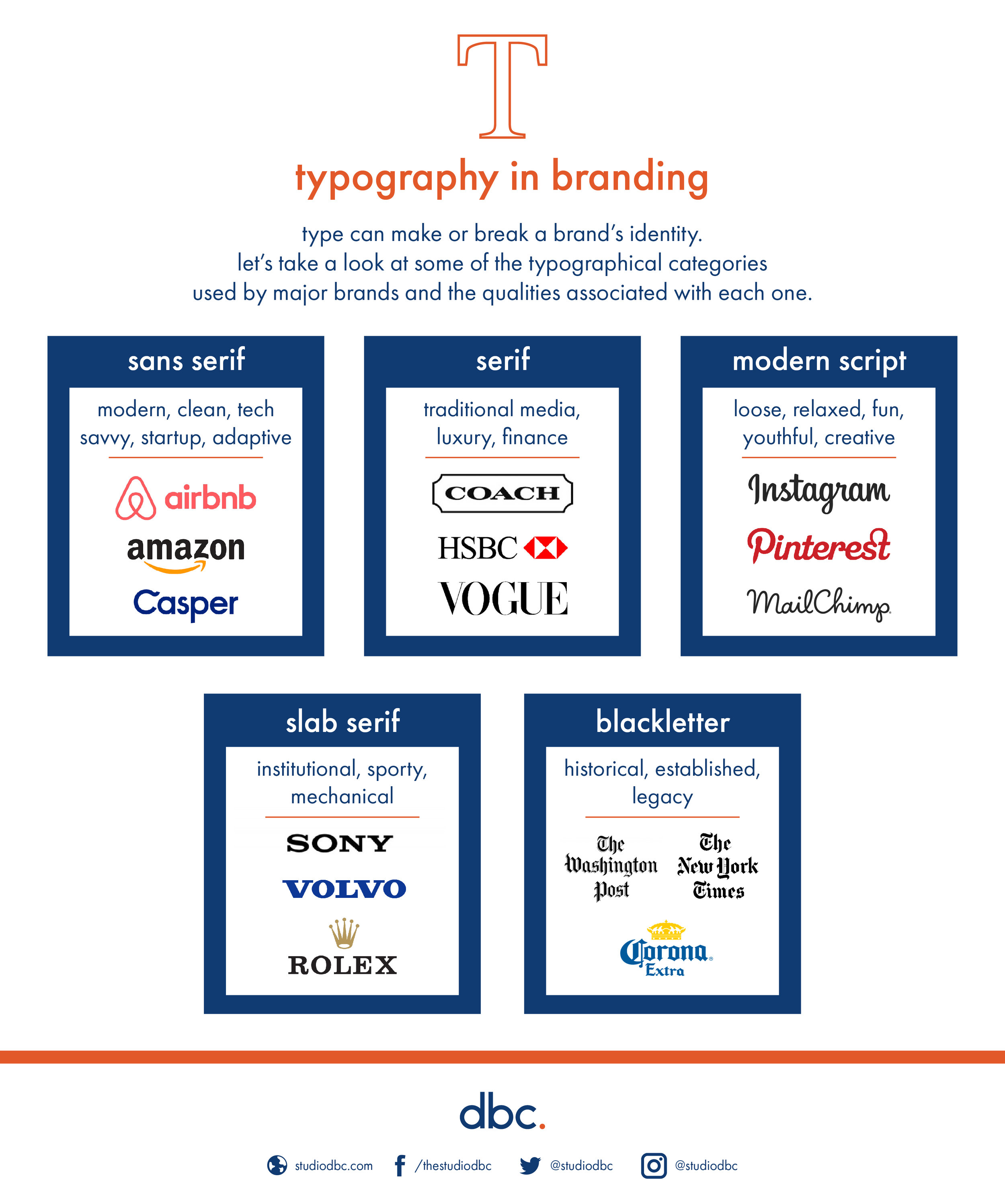
Type expresses more than just the meaning of the text it spells out. Typography can lend all sorts of associations and connotations to a brand identity. For example, sans serif type provides a more modern, minimalist feel than the more decorative serifs. This is why tech brands usually have logos with sans serif type -- to emphasize that their products are cutting edge and new. Although web fonts are constantly improving, sans serifs still translate best to the screen since the variable widths in the serifs can get lost at smaller sizes onscreen.
Type can also be used to create clever visual puns, such as the legendary FedEx logo with an arrow conveniently tucked between the E and X.
In a similar way that color communicates subtle messages about a brand, typography should be carefully considered when designing a logo. It's not enough for type to look nice; it's got to say something. Whether a logo adapts a pre-existing typeface or utilizes hand-lettering, the typography should be an appropriate choice for a brand in the moment it's designed, while also maintaining the ability to stay relevant going forward. We've designed the following infographic exploring some highly-recognizable brands and the associations their logotypes carry.